Sunday, June 26, 2005
Cover evolution
 l the artwork found on a novel cover speaks volumes. It often reflects w
1.jpg) hat is popular or accepted by its targeted audience. On one of the earlier covers, created by Robert Abbett for ACE Paperbacks, the art work is a depiction of Ish and Em. In the painting, Ish resembles a movie action hero and Em looks like a 50's suburban housewife dressed for a dinner party. The body positioning on the cover is interesting as well. Ish is clearly depicted as the leader and Em as a follower that needs to hold on to him for support. An alternative cover had been created by the artist which depicted Em in front of Ish, although at a lower level than him, dressed in a low-cut, form-fitting dress which created a much more sexual image of Em. The final cover used ignores Em's race and sexuality and places her in a subordinate position, an image of woman that was marketable at the time.
hat is popular or accepted by its targeted audience. On one of the earlier covers, created by Robert Abbett for ACE Paperbacks, the art work is a depiction of Ish and Em. In the painting, Ish resembles a movie action hero and Em looks like a 50's suburban housewife dressed for a dinner party. The body positioning on the cover is interesting as well. Ish is clearly depicted as the leader and Em as a follower that needs to hold on to him for support. An alternative cover had been created by the artist which depicted Em in front of Ish, although at a lower level than him, dressed in a low-cut, form-fitting dress which created a much more sexual image of Em. The final cover used ignores Em's race and sexuality and places her in a subordinate position, an image of woman that was marketable at the time. The original book cover art did not focus on the characters. The dustjacket cover from 1949 sho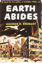 ws a city that is bleak and dark.
It is interesting to note the original book cover has no indication of human survival even though the book is very much about how humankind can survive.
The art on a 1971 Fawcett Crest cover has a science fiction "look." The figure in the picture seems to be going down a road that l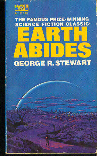 eads to a domed city. The color choice is interesting to note. Shades of blue, purple, and red are often associated with space. Even though Earth Abides is not a story about space, the cover gives it a "traditional" science fict
 ion look.
A 1983 Ballentine Books cover uses art similar to the Fawcett Crest cover. The Ballentine art has a more optimistic feel. The colors are brighter and the figure in the picture is walking down a road with light, perhaps the road to enlightenment.
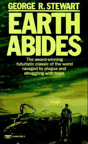
The 1986 Fawcett cover (the edition we are currently using) returns to a darker style as seen in the original jacket cover. Even the wording on the cover is dark, "the world ravaged by plague and struggling for hope." Why is there a return to the darker cover? Does it have something to do the images of the Chernobyl Nuclear Power Plant which would be on everyone's mind in 1986?
 The 2004 cover on an audio version of Earth Abides by eBook Publisher: Paperback Digital, Inc., features the Golden Gate Bridge, a prominent symbol in the novel. Although still a dark cover, it more acurately depicts the book as Ish is always making reference to the structure.
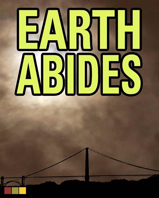
The covers on this post do not represent all of the cover adaptations of Earth Abides but they clearly illustrate how covers evolve over time. I do have one more I would like to share - it is a cover from the publisher, Minotauro and I feel it is one of the best I have seen. It features the Golden Gate Bridge, a car ( Ish spent a considerable amount of time traveling in a car in the first part of the book), and a sense that things are breaking down and falling apart. I like the brightness of the cover. It makes me feel there is hope and all is not lost. 

<< Home
![]()
